Judge A Book By Its Cover
I've done my research and appreciate the eye-catching competition. Having stared at the music section in various bookshops, I now have an idea of the kind of cover design I'd like.
You’re not supposed to judge a book by a cover, but I do. For most of us, that’s likely true, though we might not want to admit it. The subject matter is of utmost importance and the cover design should implore you to pick the book off the shelf and give it a closer look. Though I’ve only just created a mood board for the ideas floating around for my cover design, inspiration is close at hand.
Perhaps there is something about the swirl which indulges me as it appears in several designs. That sense of several elements coming together to form something powerful, that drew in onlookers, something greater than the sum of its parts. It resonates because that’s what I see as one of the main narratives in the manuscript. Yes, there were talented bands, yet as each one enjoyed success, that achievement pushed the others on. Whether it was playing an established venue, getting a demo recorded, or hitting number one with your debut single.
Venues allowed these bands to perform and technology helped fans share their songs. Furthermore, club night promoters gave those fans a social space to mingle while they dance to their favourite local bands songs. It was self-fulfilling, a creative force that propelled itself off the energy of its surroundings.
Before I get to the disparate formative elements of my cover design, I’m going to look at the ones I find inspiring.
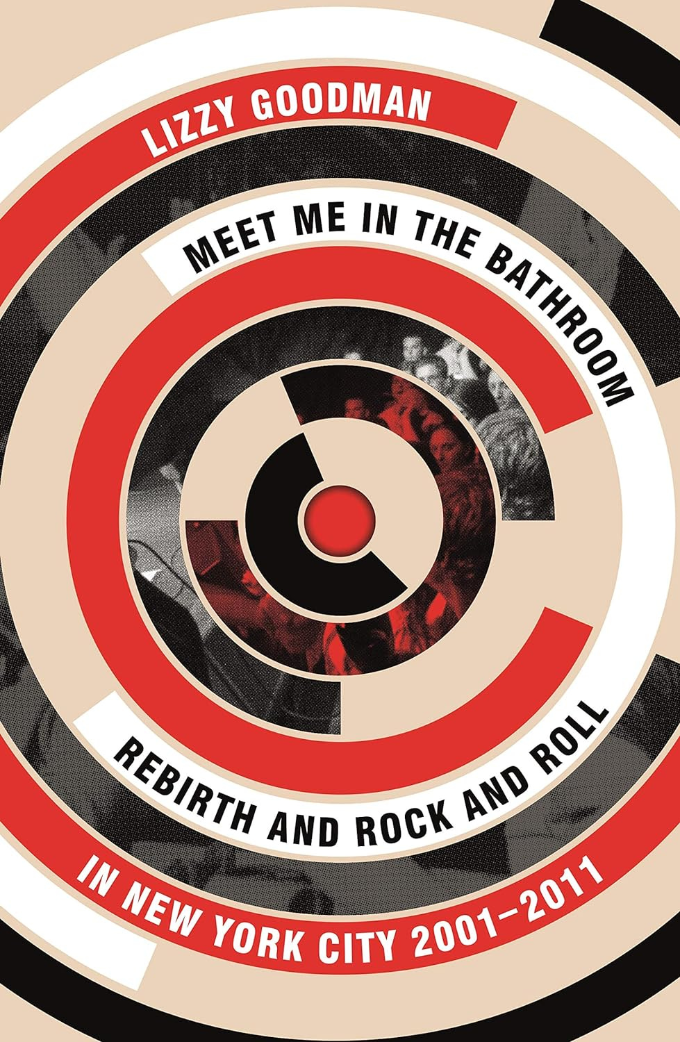
Meet Me In The Bathroom
Arguably the precursor to A Certain Romance, the images in the cover design for Meet Me In The Bathroom do not really say much at all. A few crowd shots intermingled with a darkened stage, no real sense it even involves New York City. However, stare at it for long enough and the cover appears like a moving turntable. Even the colour scheme of red, pink, white, grey and black just looks cool. That’s all you need to evoke something of a sense of the underground chaos that existed away from prying eyes. Away from the music press until it was ready to emerge with a set of captivating bands in 2001.
Manchester Unspun: How A City Got High On Music
Not going to lie, I quite like having Andy Spinoza’s book on my bedside table. Yes, it looks like a biohazard sticker, so it’s bold, striking, and vivid. I like to imagine that the yellow and black colour scheme strikes a balance. On one hand, the Manchester bee as a symbol of the hard-working nature of the city and its links to industry. On the other, the hazardous re-development that the city went through, as detailed in the book itself. There’s also the Cottonopolis link with the spiral appearing like a cotton wheel.
Last Night A DJ Saved My Life
The cover to Bill Brewster and Frank Broughton’s book simply looks sweaty, doesn’t it. You can see the beads of sweat on the faces and necks of the two revellers. Like a snapshot from any great club night, it draws you in to the possibilities of heady music and energetic dancing. The logo bounces off the cover too with some clever line work. Again, the yellow and grey works as an eye-catching colour combination.
Britpop! Cool Britannia and The Spectacular Demise of English Rock
Of course, I had to look at a John Harris book. Though I can’t quite picture the writer’s face, he seems like a bona fide literary expert on British music scenes. The cover to Britpop! is a little more low-key, with the main logo design evoking the London Underground. That makes sense, considering the capital was where most of the bands and music press were at the time. Then again, the central figure is Liam Gallagher in a parka in front of a TV set taken from the ‘Roll With It’ video shoot. Nothing too iconic, but you know what you’re getting before you read it.
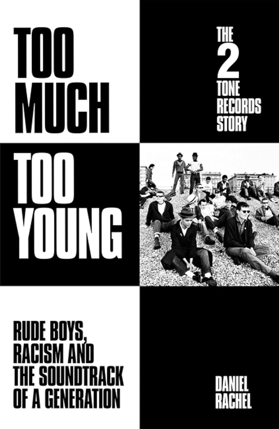
Too Much Too Young - The 2 Tone Records Story
As far as iconic covers go, anything involving Two Tone is going to be up there. Bold, black and white, minimal, and brutally effective. It must be more straightforward to write about a music scene that already has its own iconography. That’s what makes this cover design stand out, without even reading the title, you know what the book is about instantly.
England’s Dreaming - The Sex Pistols and Punk Rock
Similarly to John Harris, Jon Savage is nigh on impossible to avoid in the music section of any bookshop worth its salt. While I almost expect safety pins and ripped fishnet stockings, there’s far more going on with this cover design. Without the clothing, as designed by Vivienne Westwood, we simply have her being confronted by a policeman. It works due to punk rock’s intrinsic counter-culture and anti-establishment nous. This photo could have been taken at any gig from the time. You don’t even need to see The Sex Pistols to know they’re involved.
Ideas For My Potential Cover Design
There is little to link the two cities of Sheffield and Leeds, let alone their music scenes. Going way back, you could use the white Yorkshire rose yet that seems to have been adopted by Leeds rather than left alone as a symbol of the county itself. None of the band logos seem to mesh, and my manuscript has a lot more to it than just telling the story of the bands. How do you visualise the impact of file-sharing? With a handwritten CD-R? The Napster logo?
My mood board currently consists of the featured book covers here, the original band logos, and some candid shots from gigs, club nights, and ticket queues. There were some iconic shots taken at the time, mainly by Chris Saunders of Sandman Magazine (which I have enquired about). However, my favourite, featuring Alex Turner, Jarvis Cocker, and Richard Hawley, seems ill-placed. Only Turner and Hawley were actively performing and recording at the forefront of the New Yorkshire scene during the timeline of the manuscript. Plus, it looks like Turner is being taken to the pub with his two cool uncles. I’d love to use it as an image in the book, but it doesn’t work for a cover design.
Part of me thinks a scrapbook collage featuring all the logos, photos, and newspaper clippings has legs as a cover design. Then again, that so much existed online makes me want to see the appearance of an online message board from the 2000s. At least that would make sense. It was also the age of Myspace, Spotify, and iPods. Is it worth including them? Or simply a design like Meet Me In The Bathroom that looks good but fails to have any real association with the subject matter? Feel free to comment with your ideas.


